
Designing Bradenkoh.com (UI/UX)
When I first looked at creating my own website, I struggled with understanding how to organise everything that I wanted into a coherent structure. My goal is to be able to share my content in a way that was fun for me and useful to anyone reading. I don't have a background in design but I did want my website to behave and function in a specific way.
From there, I sort after design principles in the world of UI/UX design to try and close this gap between not knowing what looks good and wanting my site to look a certain way.
Since I have started this projects, I have made 4+ versions of Bradenkoh.com with the current one that you're reading being the latest. These versions don't include the "minor" tweaks that I have made to the site. I call them versions because I redid the entire website again.
Having said that, I am still no expert and this latest version will no doubt have issues. But my hope in writing this is that it will help you skip pass some of the pain that I experienced if you decide to design your own site.
This article won't cover tech stacks or code or even UI/UX principles but it will cover things like my flawed design process, how I chose the colours and fonts, etc.
Some History and Perspective
I think it's important to first understand where I sit on the "design" spectrum, if it even is a spectrum. Good design is subjective which means to understand where I come from, you should first understand my design preference.
I for one really like minimal web design but not at the expense of user experience. When you hide too many things, it becomes a nuisance to browse a site. So, because I wanted my site to have a newsletter, blog and a marketplace, I had to really balance the amount of information I was showing at any given time.
In my past few attempts, I tried to stick to the "minimalist" style but in the end, it became a Frankenstein of many different design philosophies that looked minimal on it's own but when combined, looked like a mess.
I wish I had images to show you but I decided to write this article long after I discontinued my older sites
Starting the Project
What was different about the latest design, was that I decided to do things the "right" way. I decided to follow and learn the correct UI/UX process when it comes to designing a website even if it meant that making this website was going to take more time.
I started by watching a couple of YouTube videos about website design. Out of all of them, these were the ones that helped me out the most :
Once, I got the gist of the process, I started to create to rough wireframes to understand where I would place my elements, how many pages to have and where all the content would go. I did this mostly by hand.
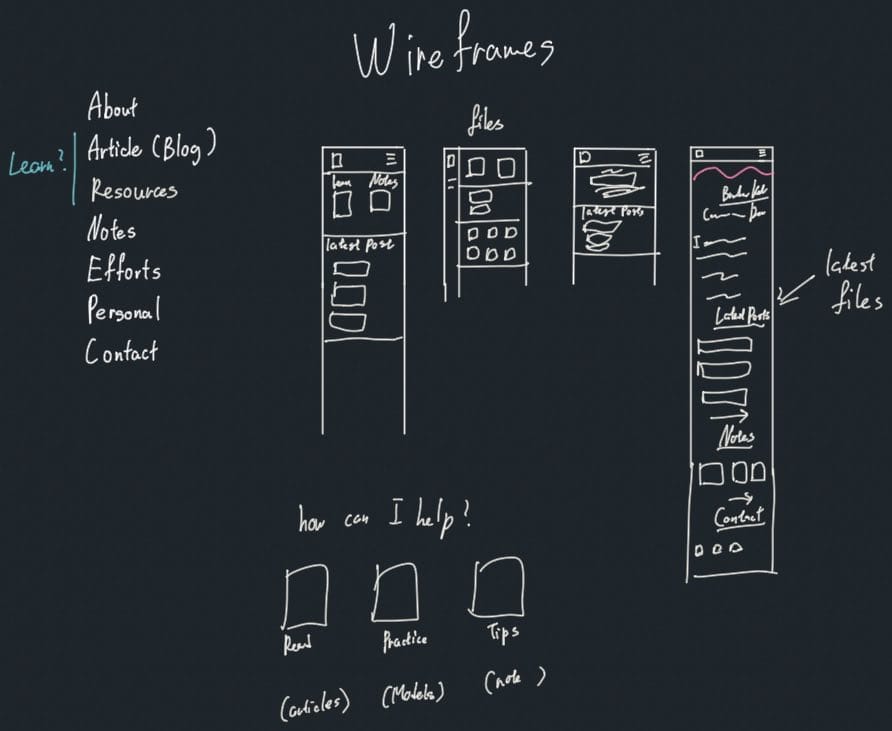
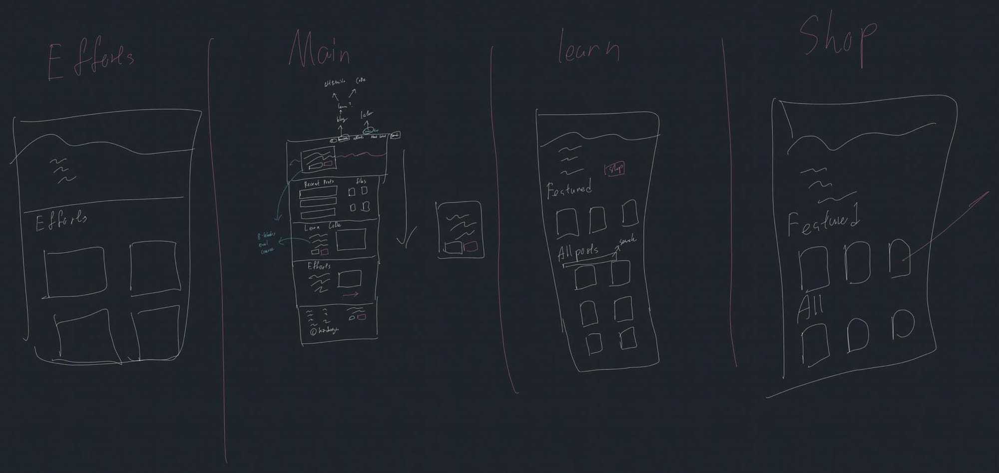
Not only was I trying to understand the layout, I also wanted to understand how information would flow in and out of the pages. Like how would I direct people where to go?
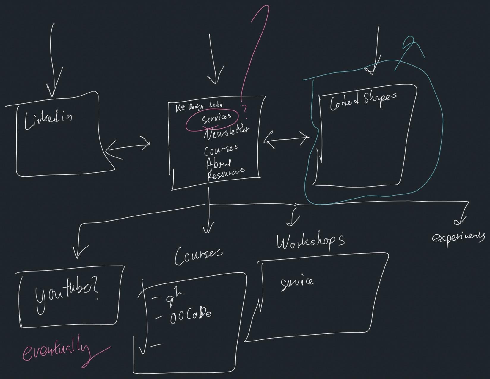
You can see that I was still trying to understand how things would be organised and doing this by hand helped. These 3 that are here are just the legible ones, I went through a lot of random scribbling to make sense of the layouts.
I drew a lot of inspiration from other websites on the layout. There were many that I loved but the ones that heavily inspired this design were :
- Maggie Appleton for her great design
- Ness Labs for her clear messaging and intention of the website
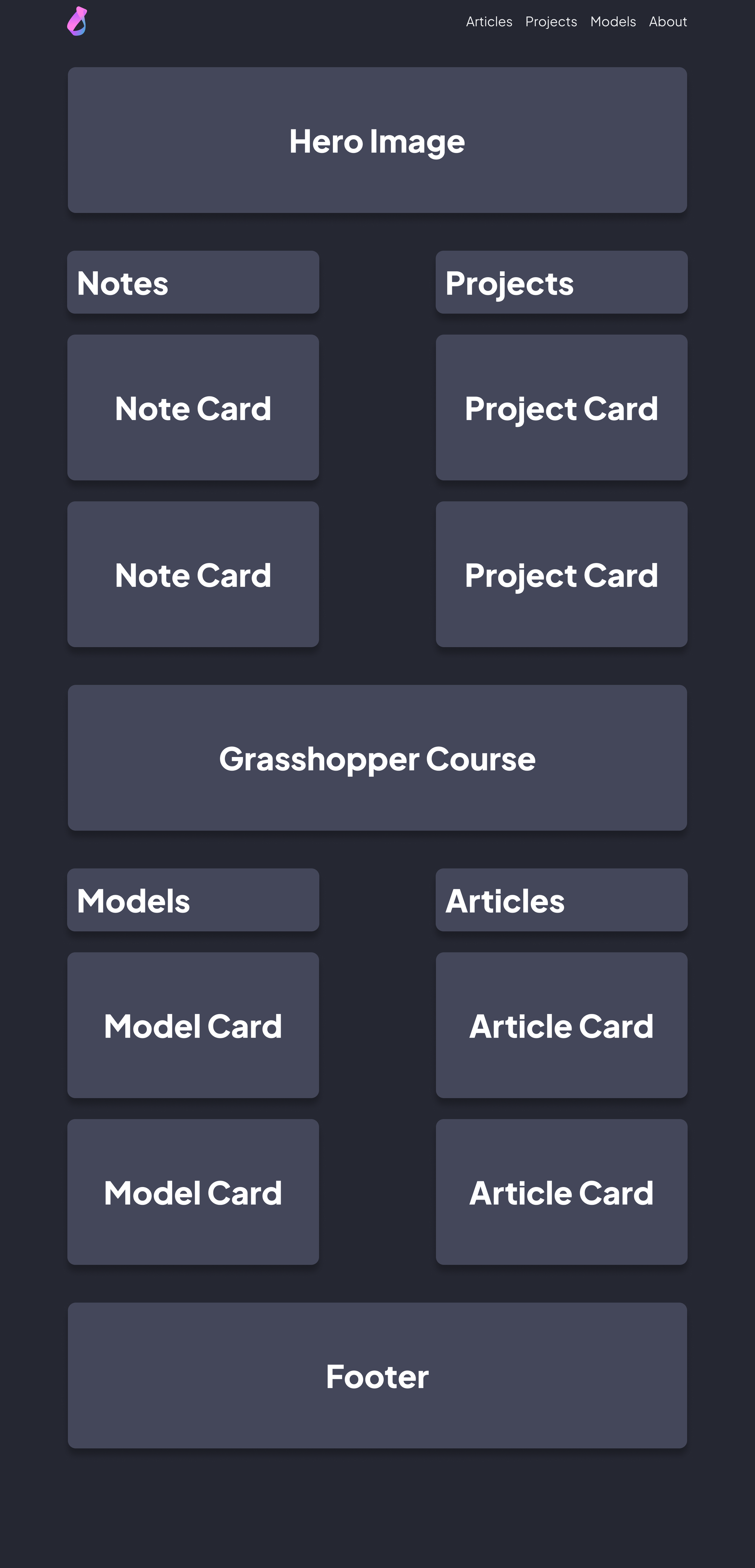
However, once I was happy with the layout, I created rough mock-ups in Figma so that I could start experimenting with colour.
Understanding Colour
Colour is what I have heard to be the hardest part about creating a website because you have an almost infinite amount of choices to choose from. Again, this is where browsing other websites has helped me out a lot.
I have always been a dark mode-only kind of person, so I wanted colours that pop out in dark mode. While there were many, I ended up adapting colours from Dracula because I love their UI philosophy. I know that doesn't help you if you are deciding on colours but I would choose a colour palette you like and tweak from there. At least you don't have an infinite amount of choices.
As I designed the other UI elements on the site, I kept the original colours because I knew they were roughly the colours I wanted. I only tweaked them after I got all the elements on my site. I adapted the colours because all their elements are used in heavy text interfaces and my website wasn't going to have as much text.
Figma's component system made testing out colours very easy. I kept a palette of colours in Figma and just kept re-assigning colours to the elements until I was happy. These were the colours (amongst others) that I ended up testing.
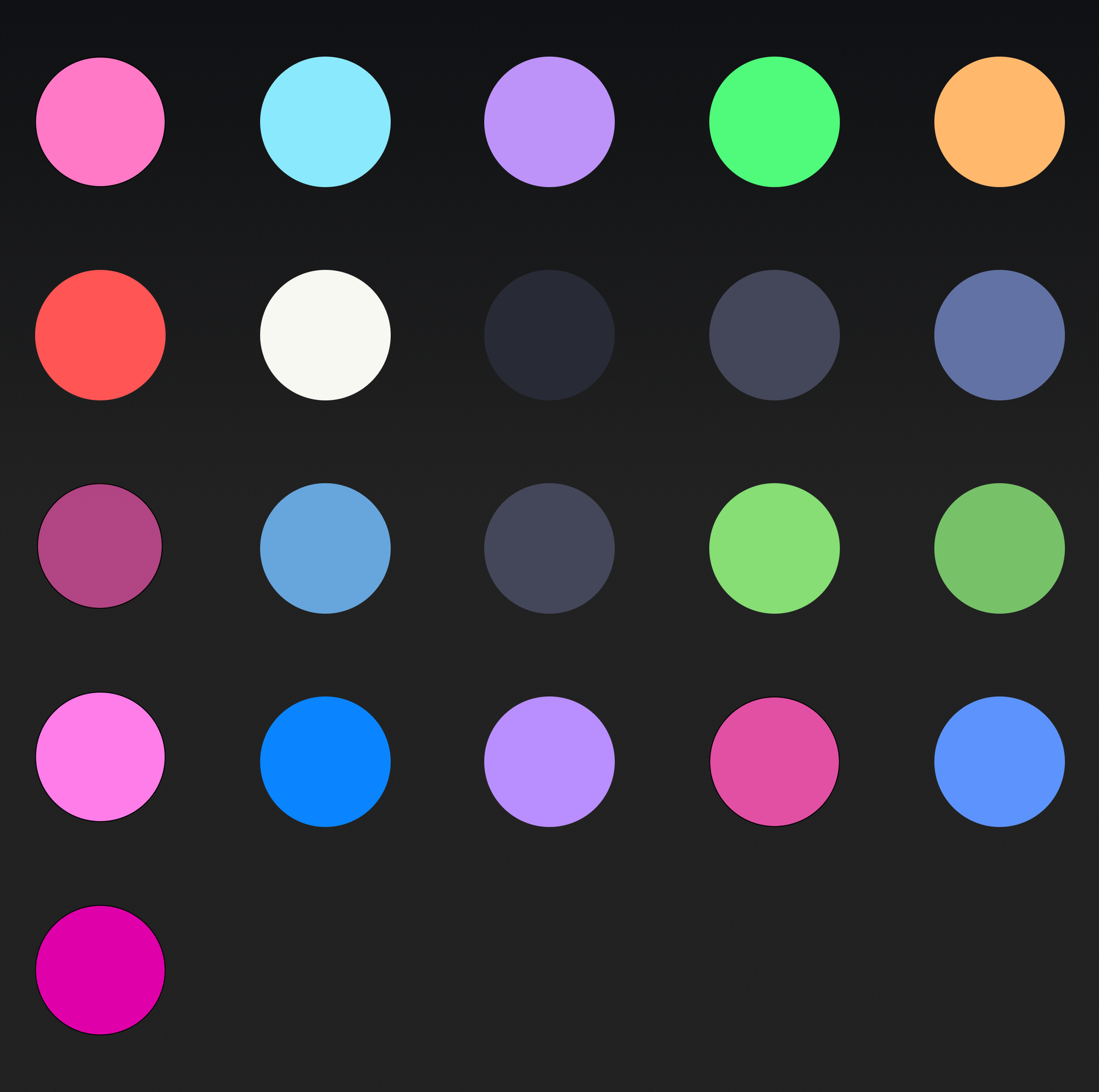
The colour style feature in Figma makes this easy to do.
Resources
Understanding Fonts and Font Scaling
I then had to figure out the fonts next. Selecting colours was largely straightforward because I think we all know what colours we instinctively prefer and like. The process of selecting fonts is a lot more abstract to me, so it took way longer.
There is a lot to learn from the world of fonts and it was overwhelming for someone who just wanted something usable and decent-looking. I ended up starting with a generic Google search like "top 10 best fonts to use for a blog/technical blogs/etc". I would then pick 2-3 fonts that stood out to me. Then I would refine the search a bit more and pick out another 2-3 fonts.
Once I had "enough" of them (I think I had like 15 fonts), I would play font battle royale. Similar to what I did for the colours, I would lay them all out in Figma and then pick the ones that I liked. Kept repeating that until I got a single font. It looked something like this:
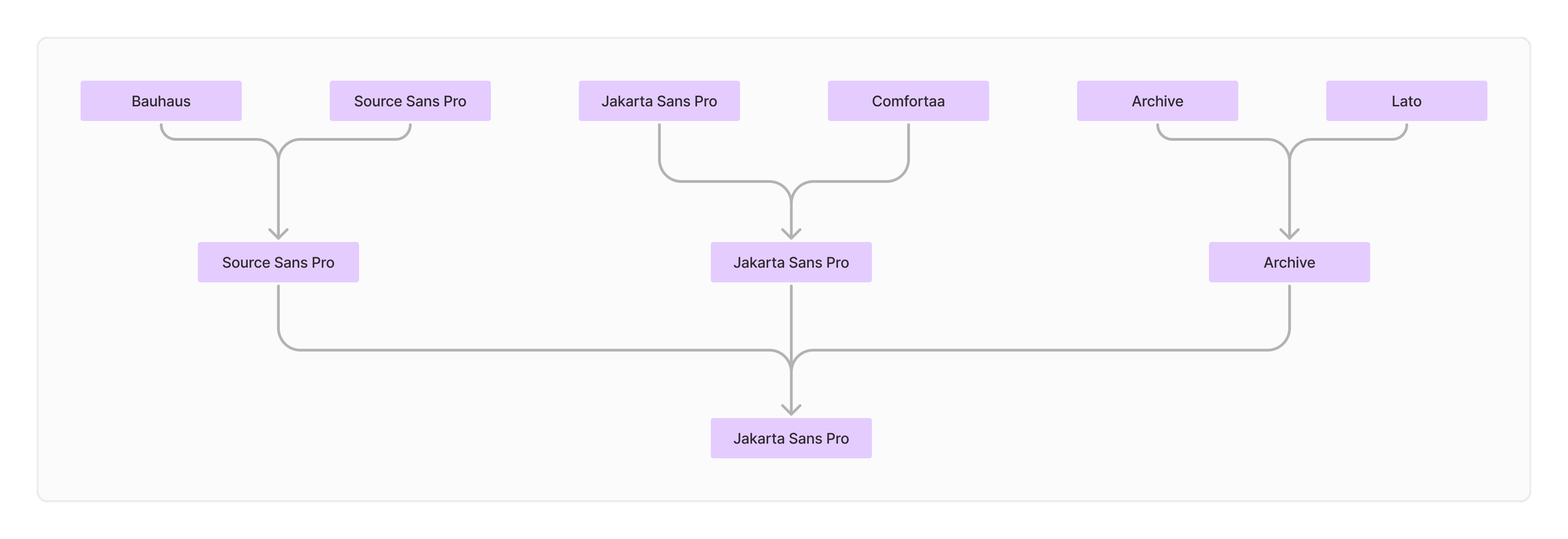
I had to repeat this process twice because I wanted a body font and a header font. For the last 2-3 fonts, I made more types of pages in Figma to ensure that it's the font I want. I lost a lot of my initial work on the fonts just because I wasn't very organised but here is what remained of the Figma file to give you a sense of what I did to compare these fonts.
Font Scaling
There is again, a whole world out there on how big fonts should be. At this point, I was pretty tired of dealing with fonts, so I watched a couple of Youtube videos and chose the simplest scale and one that made the most sense to me. I decided to use the 1.25 font scale with a 16px base size.
Resources
- Typographic scaling: Definition, Figma tutorial, and examples - LogRocket Blog
- Generate type scales with ease. It’s basically a progression of font… | by Denislav Jeliazkov | UX Planet
- Dennis Leoca YouTube
Responsiveness & Spacing
A big mistake I made with my last few websites was not designing for mobile devices. I implemented everything for the desktop but had to hack things together to make it work for other devices which was a bad idea.
So, in an effort not to repeat that, I want to incorporate the behaviour and layout of the elements for phones and tablets. The best way I found to do that was through grids.
Grids
There is again a whole world out there on the best UI/UX design grid to use but I just wanted something simple that could adapt to different screen sizes. What I ended up using was an 8pt grid and these YouTube videos helped me get there :
- Perfect Responsive Grid Systems Masterclass | UI Design & Figma Tutorial - YouTube
- Baseline Grids | The basics of Baseline Grids in UI & Web Design - YouTube
- Master Responsive Grids (Rows & Columns) in Figma - YouTubeto
Grids I found are super important because they help you add constraints to your design making it easier to manage.
Layout and Elements
Once I had all that in place, I started the process of laying out the website. Because I know web development and will be implementing these elements myself, I have an idea of the difficulty and time it would take. That instinct helped ground the design and ensured that I wasn't making unnecessarily grand UI elements.
Then once I was done with the desktop pages, I created smaller pages representing a phone and a tablet. This took me quite a long to implement because I had to tweak a lot of the UI elements and font sizes to fit the smaller screens.
It was very helpful to work through the entire design for all the screens because it helped me understand how the elements would look and feel in a more holistic sense.
A Summary
Through all of that, I finally have a UI/UX design system in Figma that can help me when I implement the elements on my actual site. A lot of what I did in Figma can be considered overkill but I wanted to start this website out the "right" way with as many best practices as I can. Maybe I was just looking to right all the wrongs I have done in my past attempts.
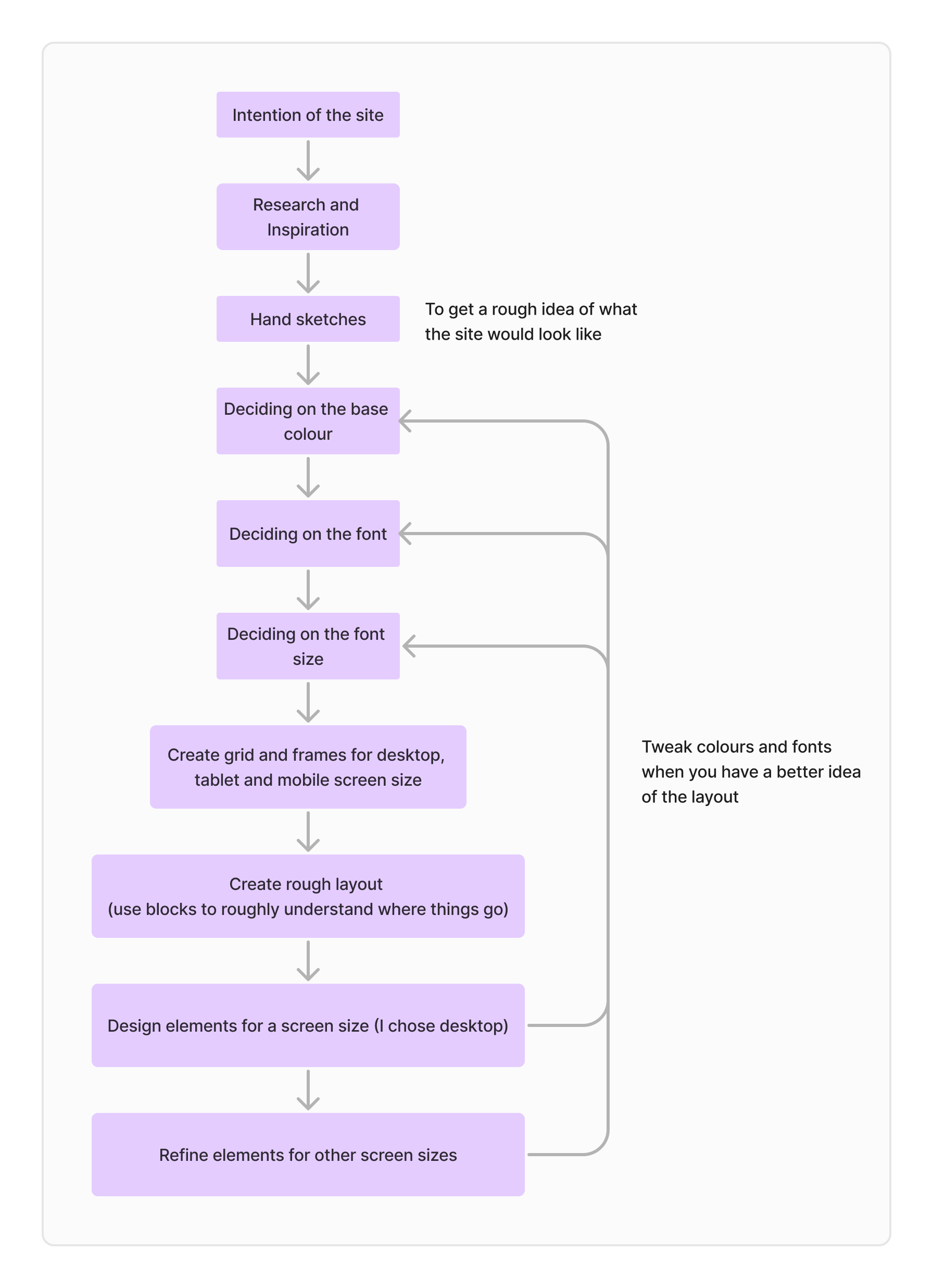
If I were to sum up my design process and the duration it took, it would look something like this:
- Getting Inspired (3 - 8 hours, spread throughout different sessions of research)
- I took notes on things like page layout, font, colours, content messaging and website structure.
- I kept a list of websites that I revisited throughout the design process just to see what others have done.
- This list was particularly useful when styling elements and making the site layout
- Exploring and Deciding Colours (2 - 4 hours, in one sitting)
- I was quicker with this because I already had an idea of what colour scheme I wanted to have
- Exploring and Deciding Fonts/Font Scaling (10 - 14 hours, in four sittings)
- I was very new to the world of fonts, so I found a lot of things overwhelming at times.
- Once, I did select my font pair, it also took me a while to understand how to best scale fonts
- Adding Layout and Styling Elements (10 - 14 hours, in four sittings)
- I already knew how to use Figma, so modifying and creating things was quite quick.
- Where I spent the most time, was getting the layout right and understanding how the content would look on the pages.
- Adding Responsiveness (8 - 10 hours, in two sittings)
- Adding more screens to the design wasn't hard, but what took time was adjusting all the other elements to fit.
- Cleaning up Figma (4 - 6 hours, in two sittings)
- I found my Figma board very messy and knew from past experience that if I had to make a change to the design, it would be difficult. So I spent some time consolidating and cleaning my board.
- I added things like text styles and colour styles to make things consistent. Also added Figma variables and components to make things more "object-oriented".
Note: I thought it was important to add the number of sittings in because long duration sittings affect my focus. Not to mention, I sometimes get new ideas in between sittings, which may push each sitting time longer because I want to try something new
Tools that Helped
- LORE (for Lorem Ipsum) | Figma Community
- Material palette | Figma Community
- Browse Fonts - Google Fonts
- heroicons | Figma Community
Final Thoughts
That describes my entire UX/UI journey in creating my own website. I had to deliberately slow down on some parts because I found myself rushing through the design process. When I noticed myself having thoughts of "wanting to just get over with it", I would take a break and that has been really helpful.
I hope this article helps you in designing your own website.